POSTS
World's average country population and inspection paradox
Have you ever thought how much is the world’s average country population? And what does it say about the country you are living in or for the quality of life of the average person? All these questions are related to what we call the “Inspection Paradox” which we are going to illustrate here using Python.
First of all we need to find some data. For that purpose we could use wikipedia. We are going to do everything without even opening a web browser! There is a nice Python library we could use to access and parse data from Wikipedia. In order to install it we need to simply run.
$ pip install wikipediaThen it is easy to search for an article containing the information we want:
import wikipedia

search_results = wikipedia.search("Countries population")
If we check the search results they are the following:
>>> search_results
['List of countries and dependencies by population',
 'List of European countries by population',
 'List of countries and dependencies by area, population and population density',
 'List of Caribbean countries by population',
 'List of African countries by population',
 'Jewish population by country',
 'List of countries by population in 1939',
 'List of Arab countries by population',
 'List of countries by population in 1700',
 'List of countries by population in 1600']
The first search result is usually the most relevant and in our case it is exactly what we want. Then we need to get the wikipedia url for that search result and then get the actual HTML for the page. In order to parse the HTML document and extract the data we want we are going to use another Python package called Beautiful Soup. This is an essential package, which is very useful for web scraping. In order to install it we run again the following:
$ pip install beautifulsoup4For an HTML parser we are going to use the default one that is included in Python’s standard library. If we want some extra speed we could also install the lxml parser but for our purposes the standard one is good enough. This is how we create a BeautifulSoup object with the default HTML parser:
from bs4 import BeautifulSoup

content = wikipedia.page(search_results[0])
soup = BeautifulSoup(content.html(), 'html.parser')
If we look in the HTML we can see that the data we are interested in are contained in a wikitable class under the tag name table. So in order to get this table we need to write:
table = soup.find('table', class_='wikitable')Now just to refresh some HTML the <tr> element defines a row of cells in a table. The row’s cells can then be established using a mix of <td> (data cell) and <th> (header cell) elements. So what we need is to iterate twice, once through the rows and once through the cells of the table. Knowing that let’s print the first three table rows to get a feeling of how the data are organized.
rows = table.find_all('tr')
for row_index, row_value in enumerate(rows[:3]):
    # Find header cells
    if not row_index:
        cells = row_value.find_all('th')
    # Find table row cells
    else:
        cells = row_value.find_all(['td'])

    for cell_index, cell_value in enumerate(cells):
        print(f'Row: {row_index + 1},
                Cell: {cell_index + 1}: {cell_value.text}')
And here is the output of the above code segment.
>>>

Row: 1, Cell: 1: Rank
Row: 1, Cell: 2: Country(or dependent territory)
Row: 1, Cell: 3: Population
Row: 1, Cell: 4: % of World Population
Row: 1, Cell: 5: Date
Row: 1, Cell: 6: Source

Row: 2, Cell: 1: 1
Row: 2, Cell: 2:  China[b]
Row: 2, Cell: 3: 1,401,217,040
Row: 2, Cell: 4: 18.0%
Row: 2, Cell: 5: 6 Feb 2020
Row: 2, Cell: 6: National population clock[3]

Row: 3, Cell: 1: 2
Row: 3, Cell: 2:  India
Row: 3, Cell: 3: 1,358,285,000
Row: 3, Cell: 4: 17.5%
Row: 3, Cell: 5: 6 Feb 2020
Row: 3, Cell: 6: National population clock[4]
As you can see from the the header information we just need cell number 2 and cell number 3. We can then create a Python dict called countries that can extract this information from the table.
import locale
import re

locale.setlocale( locale.LC_ALL, 'en_US.UTF-8' )
countries = {}
rows = table.find_all('tr')

# Ignore first and last row(header and footer)
for row in rows[1:-1]:
    cells = row.find_all(['td'])
    name = cells[1].text.strip()
    # Remove '[x]' from name
    name = re.sub(r'\[.*\]', '', name)
    population = locale.atoi(cells[2].text.strip())
    countries[name] = population
We could also save them in a Pandas data frame. For that purpose it would be easier to visualize the results by using a comma separating the thousands. We could easily do it with a dict comprehension and then create a Pandas frame.
import pandas as pd

countries_str = {k:f'{v:,}' for (k,v) in countries.items()}
df =  pd.DataFrame.from_dict(countries_str,
                             orient='index',
                             columns=['Population'])
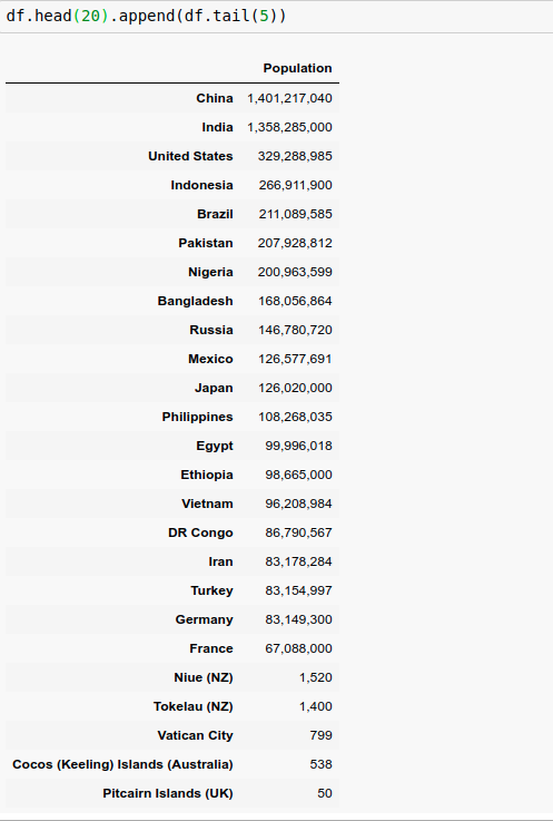
Here is a figure of the top 20 and bottom 5 countries in the world in terms of their population:
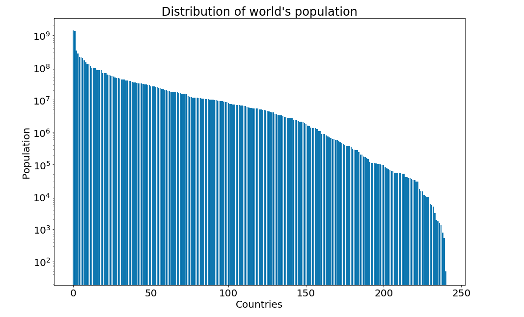
And we could easily plot using matplotlib the distribution of the population over all values using a logarithmic scale:
import matplotlib.pyplot as plt

figure = plt.figure(figsize=(15, 10))
plt.yscale('log')
plt.title("Distribution of world's population", fontsize=24)
plt.xlabel("Countries", fontsize=20)
plt.ylabel("Population", fontsize=20)
plt.tick_params(axis='both', which='major', labelsize=20)
plt.bar(range(len(countries)), list(countries.values()))
plt.show()
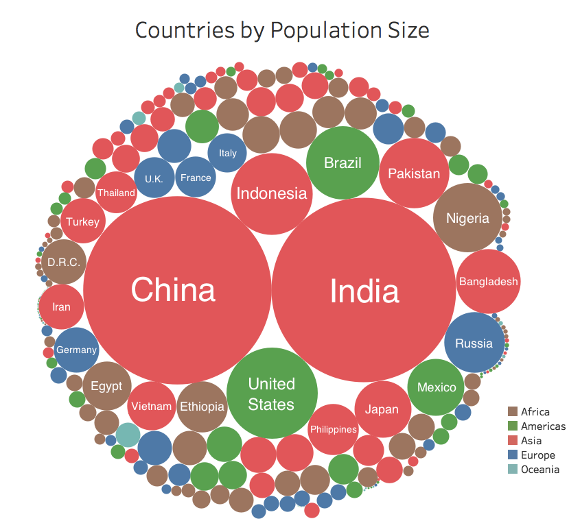
For a more comprehensive plot you could look at some statistics from here:
After getting a feeling of the distribution finding the world’s average country population is quite straightforward:
from statistics import mean

average_population = mean(v for k,v in countries.items())
>>> f"{round(average_population):,}"
'31,685,149'So the world’s average country population is around the population of Peru or Angola. Around 30 millions is kind of making sense, right? If you are living in Europe 80% of the European countries have a population of 30 millions or less. Well, it doesn’t make much sense if you are living in China or India for example. Here comes into role the infamous “inspection paradox”
To understand it better let’s reformulate the question. Instead of asking the world’s average country population let’s ask for a person’s average country population. We could pretty easily compute that in Python too
import random

countries_population = list(countries.values())
average_population = mean(random.choices(countries_population,
                                         weights=countries_population,
                                         k=len(countries_population)))
>>> f"{round(average_population):,}"
'633,938,612'That is a huge difference! This might look absurd if you consider that only two countries, namely China and India, have a population exceeding half a billion. But if you consider the humanity as a whole the average person is most likely to live in one of these two countries. To be precise 36% of the world population is either living in China or in India! So the average person’s country population is around 600 million.
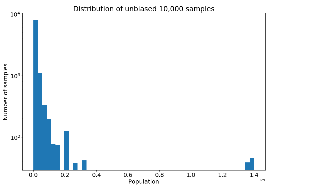
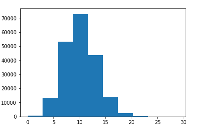
We can also infer it as a sampling problem. The “unbiased” sample is as seen by United Nations for example, with each country equally likely to be in the sample. Generating an unbiased sample of say 10,000 people is easy. We simply choose every country with equal probability:
from functools import partial

# Rank countries according to their population and store them in a dict
countries_ranks = {k:v for k,v in enumerate(countries.values())}
# Choose 10000 samples with replacement from the list of all countries
sampled_ranks_unbiased = partial(random.choices,
                                 list(range(len(countries))),
                                 k=10000)()
# Get the population of these samples from the dict of the ranks
values_unbiased = [countries_ranks[elem] for elem
                   in sampled_ranks_unbiased]
If we plot the distribution of the unbiased samples we will notice that most samples have small population values.
figure = plt.figure(figsize=(15, 10))
plt.yscale('log')
plt.title("Distribution of unbiased 10,000 samples", fontsize=24)
plt.xlabel("Population", fontsize=20)
plt.ylabel("Number of samples", fontsize=20)
plt.tick_params(axis='both', which='major', labelsize=20)
plt.hist(values_unbiased, 50)
plt.show()
To generate a biased sample as we did in Python before, we use the values themselves as weights and resample with replacement.
# Choose 10000 samples with replacement from the list of all countries
sampled_ranks_biased = partial(random.choices,
list(range(len(countries))),
k=10000,
weights=countries_ranks.values())()
# Get the population of these samples from the dict of the ranks
values_biased = [countries_ranks[elem] for elem
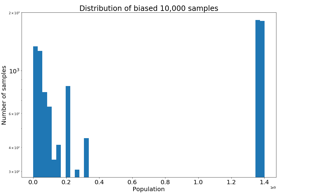
in sampled_ranks_biased]As you can see in the biased sample distribution a great proportion to the samples belong either to China or India the two most populous world countries.
figure = plt.figure(figsize=(15, 10))
plt.yscale('log')
plt.title("Distribution of biased 10,000 samples", fontsize=24)
plt.xlabel("Population", fontsize=20)
plt.ylabel("Number of samples", fontsize=20)
plt.tick_params(axis='both', which='major', labelsize=20)
plt.hist(values_biased, 50)
plt.show()
 The same argument can be applied to the population of the cities. It will turn out that the average person is most likely living in an overpopulated, noisy, and polluted urban district than in a small, quiet, and idyllic village. The government in many countries may complain that the small countryside towns are left deserted, while at the same time the citizens might complain that they live in packed towns. They can both be right at the same time. Only a few lucky citizens can enjoy the extra space and clean air of the countryside. But when living in big cities a lot of people experience the problems associated with them.
The inspection paradox is a form of length biased sampling, where members of the population are sampled in proportion to size, length, duration, etc. Differences result in the perception of events based on whether we consider events from the point of view of the typical event or the typical person participating in an event.
In fact there are many more applications, where the inspection paradox comes into place:
-
Average class size: Teachers might report a number of around 30, while students might report a number around 60. The typical student is not likely to be in a small class. They are most likely to be in a large class, because that’s where most of the students are.
-
Average family size: Asking children about the average family size will overestimate the results. Families with no children are not represented, while families with x children are over-represented by a factor of x.
-
Flight occupancy: Airlines complain that many flights are empty, while passengers complain that most of their flights are uncomfortably full. Again a plane with x passengers is oversampled by x.
-
Call center waiting time: On average the call centers might report a waiting time of 2 minutes for their calls, while customers might report a waiting time of 5 minutes. The majority of customers are the unlucky ones, who experience long waiting times.
-
Waiting for a taxi: It is more likely to call a taxi when it is raining for example and thus experience the difficulty of finding one. The customers who ask for a taxi on a sunny day are underrepresented.
-
Waiting for a bus or train: If a bus or train arrives every 20 minutes on average and there is some variation on the frequencies, e.g some buses run every 5 minutes and some other every 40 minutes, then your average waiting time is not 10 minutes but more. You are more likely to arrive during a long interval than a short one. Intervals of duration t are oversampled by a factor of t. When we say average waiting time, this refers to the average time distance between two consecutive bus arrivals. For example if between 17.00 and 18.00 we have the following bus schedules: 17.00, 17.02, 17.10, 17.15, 17.45, 17.50, 18.00. Then the average time between two bus arrivals is ten minutes, thus the average waiting time should be five minutes, right? In reality though, it is more likely to arrive during the longest interval between 17.15 - 17.45 and wait longer. This becomes evident if we try and simulate this case:
sum_waiting_times = 0 bus_arrivals = [0, 2, 10, 15, 45, 50, 60] simulation_trials = 100000 for i in range(simulation_trials): person_arrival = random.choice(range(61)) waiting_time = min([bus_arrival - person_arrival for bus_arrival in bus_arrivals if bus_arrival >= person_arrival]) sum_waiting_times += waiting_timeThe average waiting time for a person is 8.6 minutes, which is 72% larger than what the bus authorities would report as average waiting time (5 minutes)!>>> print('Average waiting time per person:', sum_waiting_times / simulation_trials), 'minutes.') Average waiting time per person: 8.67072 minutes. -
Friendship paradox: Most people have fewer friends than their friends have, on average. People with greater numbers of friends have an increased likelihood of being observed among one’s own friends. You’re more likely to know more popular people, and less likely to know less popular ones. In contradiction to this, most people believe that they have more friends than their friends have.
-
Facebook friends paradox: Your friends on Facebook are ~80% likely to be more popular e.g. have more friends than you. If we think of the friends relation as a graph then picking a node at random a node with degree x is oversampled by x. See also a formal mathematical proof here on Wikipedia
-
Publications paradox: One’s co-authors in a scientific paper are on average likely to be more prominent, with more publications, more citations and more collaborators.
-
Gym rats paradox: The average people you encounter in your gym are much fitter than you are, since you clearly don’t see the potato couches crashing your gym.
-
Romantic partners paradox: Your romantic partner is likely to have had more partners than you because you’re more likely to be part of a larger group than a small one. This is not true in all individual cases, but instead is a trend across all cases. To demonstrate this paradox we decide to model romantic relationships using a bipartite graph (let’s assume heterosexual relationships for simplicity). A bipartite graph (or bigraph) is a graph whose vertices can be divided into two disjoint and independent sets U and V such that every edge connects a vertex in U to one in V. We consider such a graph with 100,000 males being set U and 100,000 females being set V with a distribution around 10 partners for each person.
 Then we simulate the following: Pick a node in the graph at random and count the romantic partners it is connected to. Then choose one of the original’s node romantic partners at random and compare their number of partners with the original one’s.
 $ pip install networkxfrom networkx.algorithms.bipartite import random_graph males = 100000 females = 100000 G = random_graph(males, females, 0.0001) trials = 10000 count = 0 for i in range(trials): random_node = random.choice(range(males + females)) num_partners = len(list(G.neighbors(random_node))) try: random_partner = random.choice(list(G.neighbors(random_node))) except IndexError: pass num_partners_partners = len(list(G.neighbors(random_partner))) if num_partners_partners > num_partners: count += 1As you see the paradox is true. The probability that someone’s partner has more partners than themselves is more than half. In reality it can be even more since the distribution of a “relationship” network can be more biased and skewed than the case presented here.>>> print(count / trials) 0.5397 -
Mykonos beaches paradox: Most people complain about beaches in Mykonos being overcrowded. Yet, most people visit the island in the peak summer months when it is most likely to encounter crowded beaches.
-
Race paradox: On a running competition or on a highway everyone seems to go either much faster or much slower than you do. You hardly ever see someone going at your speed.
-
Longevity paradox: Someone who is already 60 years old is highly likely to live longer than the average because … well they already lived 60 years!
-
Cancer screening: Detecting cancers by early screening causes cancers to be less dangerous, even if in reality it has no effect. Simply, less dangerous cancers are more likely to be detected by screening. Fast-growing tumors generally have a shorter asymptomatic phase than slower-growing tumors. This problem is of considerable importance in immunogenetics for determining whether a characteristic is related to disease etiology, or whether, instead, it is of prognostic importance for individuals who have already developed the disease.
What is more interesting is that the inspection paradox becomes more prominent in higher dimensions. For a multivariate normal distribution in high dimensions, nearly all the probability mass is concentrated in a thin shell some distance away from the origin. This is also related to the Simpson’s paradox, in which a trend appears in several different groups of data but disappears or reverses when these groups are combined. For example suppose you want to design a one size-fits all glove. By combining different measures of different people’s hand attributes and averaging over all of them, you might end up with the glove that fits nobody well. See for example a very simple case in two dimensions. Suppose you have the following individuals measured height and weight:
| Height(cm) | Weight(kg) |
|---|---|
| 180 | 60 |
| 190 | 80 |
| 200 | 85 |
| 215 | 95 |
| 150 | 65 |
| 150 | 70 |
| 165 | 90 |
| 170 | 100 |
| 165 | 100 |
| 160 | 90 |
If we wanted to compute the average person’s height and weight and use them to design some clothes this would be 174.5 cm and 83.5 kgs. But this not only it wouldn’t fit any person from the list, but it would also be very inaccurate even for the persons who are close to these numbers. A person who would be closest to 83.5 kgs would be either 2 meters or 1.9 meters tall instead of 1.745 meters tall, while a person who would be closest to 1.745 meters tall would weigh either 60kgs or 100kgs instead of 83.5kgs.
Benefits of the Inspection Paradox: Companies only recently start to realize that calculating the average on their side does not say much about customer satisfaction. So using the implications of this paradox they can design more customer friendly experiences. There is a huge potential also in epidemiology. Flu outbreaks can be detected almost 2 weeks before traditional surveillance measures can by using the friendship paradox in monitoring the infection in a social network by analyzing the health of central friends. This study may be unique in demonstrating that social position affects one’s risk of acquiring disease. See here for more info..
Looking forward to hearing any of your encounters with the inspection paradox in the comments!
References:
A great explanation by Allen Downey can be found here